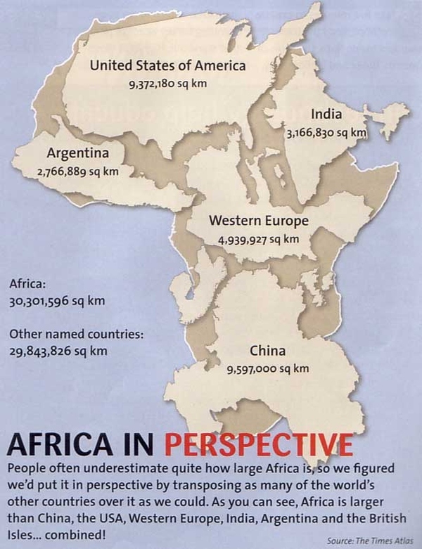
Getchee, a blog focused on data-based retail and banking strategies, used data from The Times Atlas to create this infographic illustrating how vast Africa really is. As the creators note, many people underestimate just how expansive the continent is. The infographic puts things in perspective by imposing other countries and Western Europe onto the continent to show how many can fit. The United States of America, India, Argentina, Western Europe, the British Isles and China all fit with room to spare. Not only does the infographic help readers understand the size of Africa but it may also help to point out how many different cultures, climates, and landscapes exist there, as well as how many opportunities for business and partnerships.