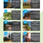
Rayna Tours, a destination management company based in Dubai, made this infographic to highlight the top 10 attractions on the island nation of Sri Lanka. It lists the top 10 things people should see when they go to Sri Lanka. Next to the name of each destination is a photograph of the place as well as a description. It starts with the capital city of Colombo, followed by Yala … [Read more...]
Africa in Perspective
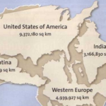
Getchee, a blog focused on data-based retail and banking strategies, used data from The Times Atlas to create this infographic illustrating how vast Africa really is. As the creators note, many people underestimate just how expansive the continent is. The infographic puts things in perspective by imposing other countries and Western Europe onto the continent to show how many … [Read more...]
Most Widely Spoken Languages Around the World
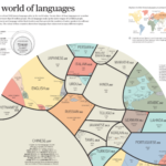
Of the thousands of languages spoken in the world, 23 are a mother tongue for more than 50 million people. This infographic is called “A World of Languages.” It illustrates who speaks each of these 23 languages. It begins with a circular graph in which each of the 23 languages is represented with a color and section. The sections are relative in size to the number of people who … [Read more...]
The Difference Between the UK, Great Britain, and England
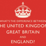
Do you know the difference between England, Great Britain, and The United Kingdom? Sala Language Schools Osaka made this infographic called “What’s the Difference Between The United Kingdom, Great Britain and England?” to explain the three terms. It begins with three sections describing each term, complete with an illustration of the geographical area and which countries are … [Read more...]