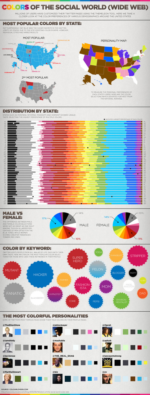
Twitter’s Themeleon tool allows users to customize their background color. This infographic, titled “Colors of the Social World (Wide Web),” illustrates how different demographics prefer particular colors. It is divided into five sections or categories. The first shows three maps of the U.S. and the most popular colors by state. The second shows a graph with the 50 states on the y axis and the color distribution among the population on the x axis. Next, there are graphs showing color distribution among men and women. Then, it shows the correlation between colors and popular profile keywords. Finally, you’ll see celebrity Twitter users’ color choices.
