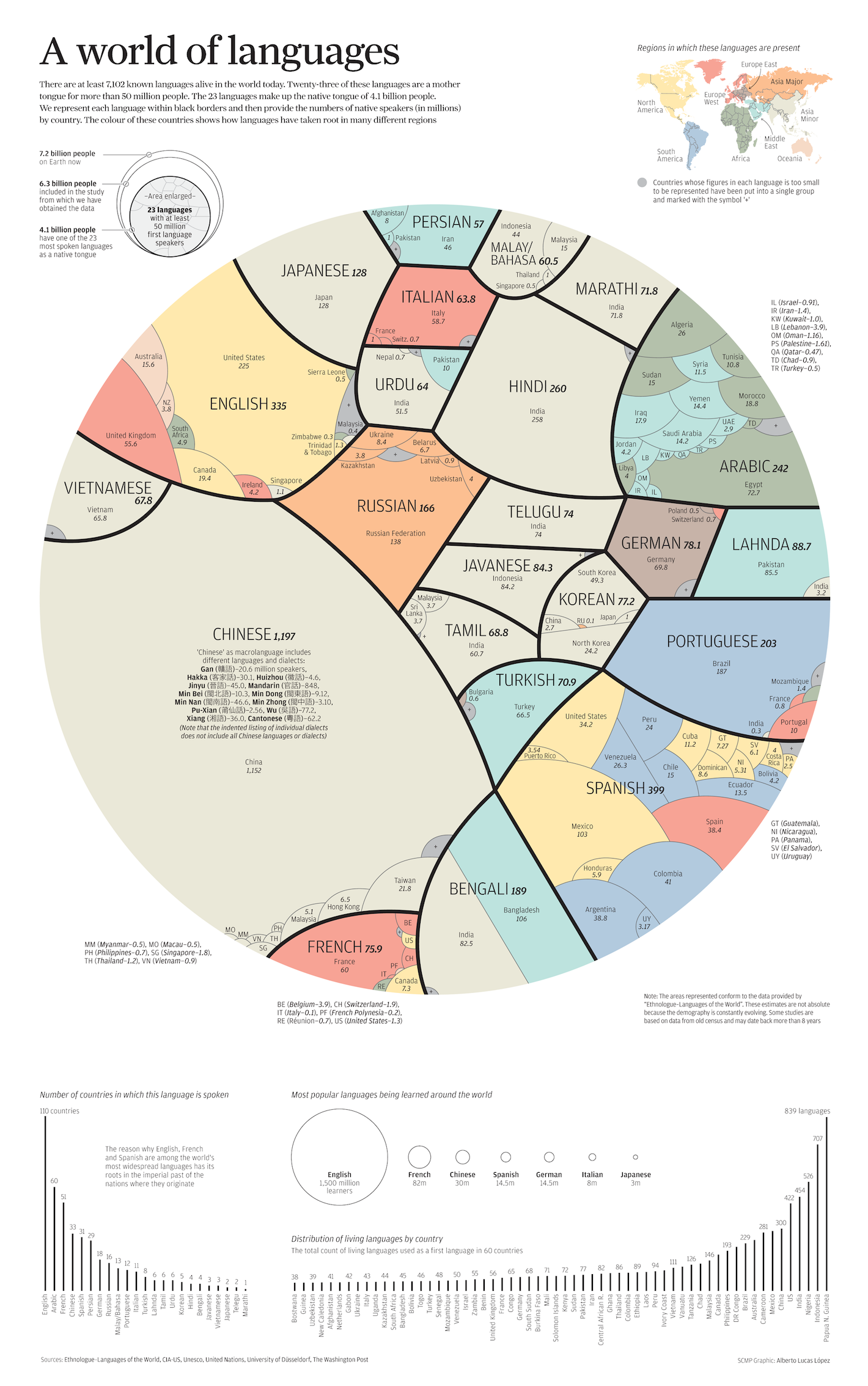
Of the thousands of languages spoken in the world, 23 are a mother tongue for more than 50 million people. This infographic is called “A World of Languages.” It illustrates who speaks each of these 23 languages. It begins with a circular graph in which each of the 23 languages is represented with a color and section. The sections are relative in size to the number of people who speak it. Inside each section, you’ll find the names of some of the major countries in which the language is spoken. In the upper right corner, you’ll also find a world map color-coded to show which regions have the most speakers of a particular language. At the bottom, you’ll find bar graphs illustrating the countries where major languages are spoken, as well as how many people are learning certain languages.