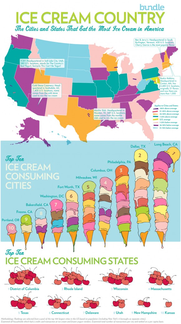
Bundle made this infographic entitled “Ice Cream Country” which illustrates the cities and states that consume the most ice cream. The graphic depicts a colorful map of the United States. Each state is a different color, symbolizing the percentage of ice cream consumption per capita. The number is compared to the national average. The infographic also shows where big ice cream manufacturers, like Baskin Robbins and Cold Stone Creamery, are headquartered. At the bottom of the infographic you’ll find the 10 cities that consume the most ice cream. You’ll also find the top 10 ice-cream loving states.
