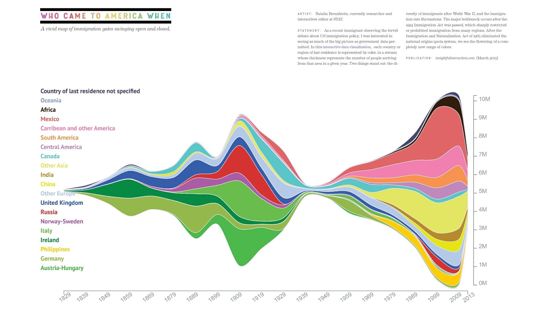
Artist Natalia Bronshtein, a researcher and interactives editor at STAT, created this infographic to illustrate when different groups of people immigrated to the United States. The infographic was originally published on Insightfulinteraction.com in March 2015. Bronshtein, an immigrant herself, said she was inspired to create this piece because of the fervent political debate regarding immigration in the U.S. and around the world. The graphic shows data from 1829 all the way to 2013. It’s color-coded so that each country or region is associated with a certain color, which corresponds to a line on the graph. The right side of the graph has a y-axis outlining how the number of immigrants (in millions).