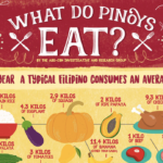
ABS-CBN Investigative and Research Group made this infographic to illustrate the average Filipino diet. First, the infographic explains how much of certain foods the average Filipino eats each year. These include rice, squash, eggplant, papaya, chicken, pork, beef, bananas, and mangoes. In the second section, the graphic shares some statistical data about how the average … [Read more...]
Any content about food and drink. This includes restaurants, cocktails, beer and wine, and so on.
What Hidden Additives Are You Eating in Japan?
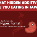
Healthy Tokyo, a health, shopping, and lifestyle website, created this infographic illustrating the hidden additives found in many Japanese foods. Each of the additives described may be hazardous or detrimental to health. It begins with additives in meat products, including sodium hypochlorite, nitrites, and hormones, as well as antibiotics (particularly in chicken). The … [Read more...]
Guide to Using Herbs When Cooking

Heiton Buckley Builders Merchants crafted this infographic entitled “Herb Guide to Cooking,” which explains how to use different culinary herbs in the kitchen. At the top, you’ll find a key with color codes. Light blue indicates complements; green is for complementary herbs, spices, and flavors; golden yellow is for recipe ideas and tips; and lavender is for the best oils to … [Read more...]
Meal Prep for Beginners

We know we should eat better. But that takeout salad is pretty expensive, and it’s not very filling. And who has time to make dinner at the end of a long day? We’re here to help you hack your kitchen. Using the popular #SundayPrep technique, it’s possible to eat better while saving time and spending less. Here’s how it works. … [Read more...]
Which States Eat the Most Ice Cream
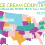
Bundle made this infographic entitled “Ice Cream Country” which illustrates the cities and states that consume the most ice cream. The graphic depicts a colorful map of the United States. Each state is a different color, symbolizing the percentage of ice cream consumption per capita. The number is compared to the national average. The infographic also shows where big ice cream … [Read more...]